Design Systems: The Cornerstone of Digital Product Development
Published on Friday, November 4, 2022
Last updated Wednesday, November 1, 2023
10 min read
Design systems often evoke images of pixel-perfect UI components, harmonious color palettes, and neatly organized design tokens. While these elements are undeniably crucial, they barely scratch the surface of what makes a design system truly impactful. This article aims to equip you with the knowledge and tools you need to build or contribute to a successful design system. In the sections that follow, we'll delve deep into the nuts and bolts of creating and maintaining a design system. We'll explore the toolchain that powers it, discuss the process of designing and developing components, examine various workflows, and much more. Whether you're a designer striving for more seamless workflows or a developer looking to streamline your codebase, you'll find practical guidance that goes far beyond aesthetics.
The Problems Design Systems Solve
In many organizations, design and development happen in isolation, leading to a loss in translation of design intent. This is where the concept of UX Engineering comes into play. As a discipline, UX Engineering serves as a conduit between designers who focus on the 'what' and developers who focus on the 'how.' A robust design system, therefore, is not just a library of assets; it's a facilitator of this interdisciplinary dialogue.
The absence of a design system often leads to inconsistencies in UI, code duplication, and ultimately, a disjointed user experience. These issues not only frustrate end-users but also increase the development time and costs. Design systems address these challenges by:
- Promoting Consistency: Ensuring uniformity in design and interaction across different parts of the application.
- Enhancing Collaboration: Bridging the often-siloed worlds of design and development, enabling more seamless communication and collaborative problem-solving.
- Accelerating Development: Reusable components and well-documented guidelines speed up the development process, allowing for quicker iterations and product launches.

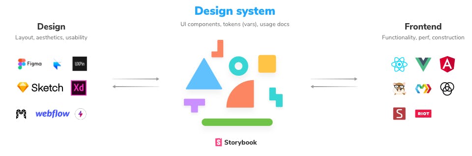
The Toolchain: Assembling the Right Tools for the Job
Building a design system is like constructing a well-oiled machine; every tool in the chain has a specific function, and they must work seamlessly together to produce a coherent output. Let's take a closer look at each tool's role in the design system.
Version Control: Git
Version control is the backbone of any collaborative development project. Git, for example, provides robust branching and merging capabilities. This ensures that multiple team members can work on different features simultaneously without stepping on each other's toes.
Design Collaboration: Figma
In the realm of design, Figma stands out for its real-time collaboration features. The tool allows designers to work together on the same design file, facilitating quick iterations and immediate feedback. Moreover, Figma's API enables us to automate design token extraction, bridging the gap between design and development.
UI Framework: React
When it comes to building dynamic UI components, React is a popular framework of choice. Its component-based architecture aligns perfectly with the modular approach of a design system. Plus, it offers an extensive ecosystem and community support, making it easier to integrate with other tools and libraries.
Component Library: Storybook
Storybook serves as a component workshop. It provides an isolated environment where developers can build and test UI components without worrying about application-specific dependencies. It also offers features like 'Knobs' for interactive component testing and 'Docs' for auto-generating component documentation.
Live Documentation and Testing: Chromatic
Chromatic takes Storybook to the next level by hosting it as live documentation. It provides visual testing capabilities to catch visual regressions and serves as a platform for design reviews, ensuring that the components meet design specifications.
Package Management: NPM
NPM acts as the distribution hub for the design system. Once the components are developed and documented, they are packaged and published to NPM. This allows other projects to easily consume and implement them, ensuring a consistent look and feel across different applications.
Why These Tools?
The selection of the tools listed above are not arbitrary; they were based on several factors:
- Interoperability: How well the tools integrate with each other.
- Community Support: The availability of tutorials, plugins, and open-source knowledge.
- Scalability: The ability of the tool to adapt as the design system grows in complexity.
- Ease of Use: The learning curve associated with each tool.
By meticulously choosing the right tools, a team can build a toolchain that not only meets its current needs but also anticipates future challenges.
Process Overview: A Roadmap to Cohesion
Creating a design system is not a one-and-done affair; it's an ongoing, iterative process that evolves with your product and team. Here, the key moments are outlined in this iterative journey, from initial research to deployment and maintenance.
Research and Analysis
Before diving into design and development, it's crucial to understand the needs of your users and the objectives of your business. This stage often involves:
- User Interviews: To gather insights about user needs and pain points.
- Competitive Analysis: To understand market trends and identify opportunities for differentiation.
- Stakeholder Interviews: To align the design system with business goals and constraints.
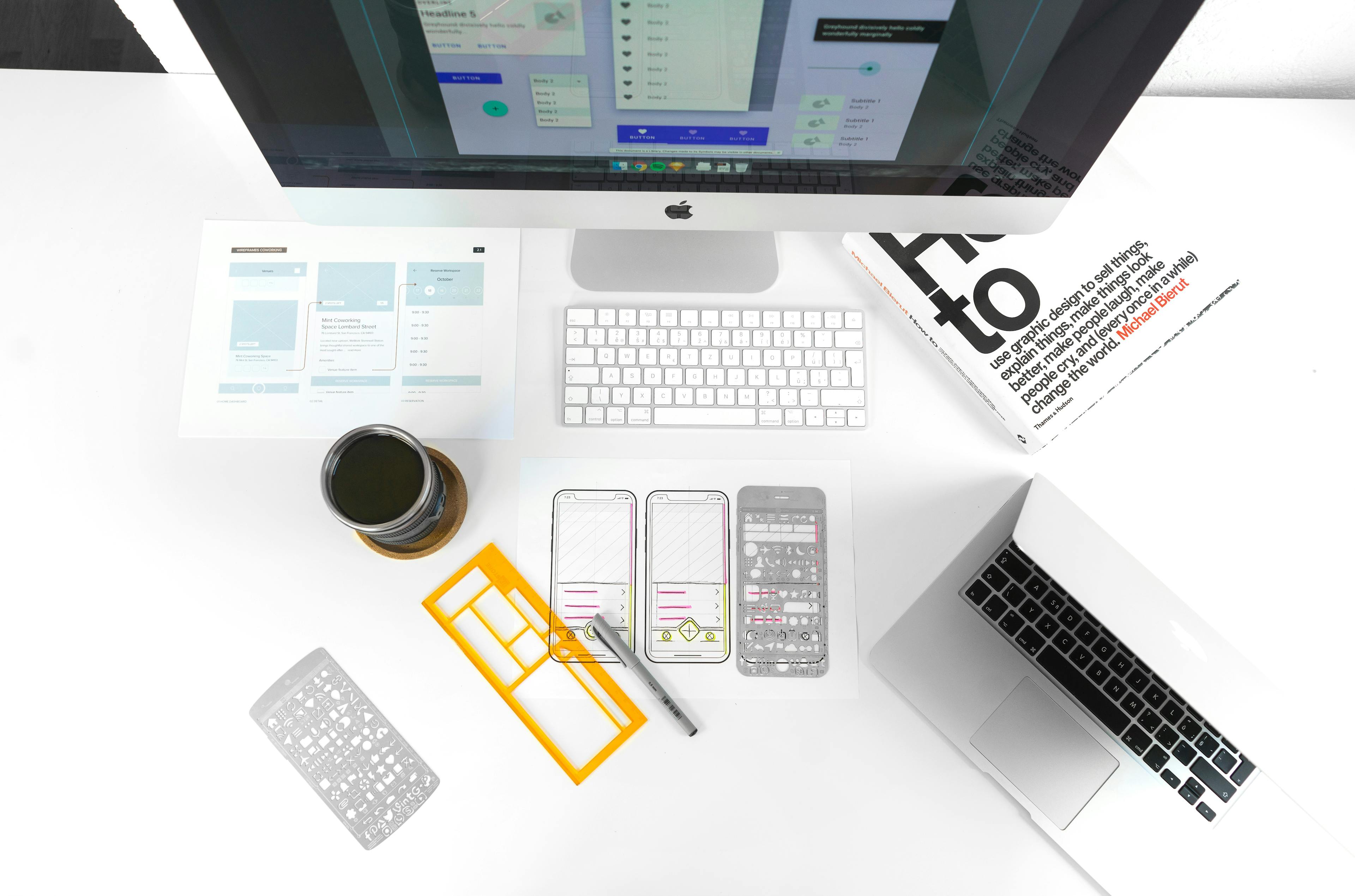
Design
Armed with research insights, designers begin crafting reusable components and patterns. Key activities include:
- Sketching and Wireframing: For rapid ideation and concept validation.
- High-Fidelity Prototyping: To visualize the final look and feel of components.
- Design Token Creation: To standardize colors, typography, and spacing.
Development
Once the designs are approved, developers take over to translate them into code. This stage focuses on:
- Component Development: Converting design assets into reusable code components.
- Documentation: Creating comprehensive guides on how to use each component.
- Code Reviews: Ensuring the code meets quality and performance standards.
Testing
Before the components are ready for prime time, they undergo rigorous testing. This includes:
- Unit Testing: To validate the functionality of individual components.
- Accessibility Testing: To ensure compliance with accessibility standards.
- Visual Regression Testing: To catch any unintended visual changes.
Deployment and Maintenance
The final stage involves making the design system available for use in various projects and continuously updating it to meet evolving needs. Key activities here are:
- NPM Publishing: Distributing the components for easy consumption.
- Semantic Versioning: Keeping track of updates and changes.
- Community Engagement: Soliciting feedback and contribution from the broader team and organization to keep the design system alive and relevant.
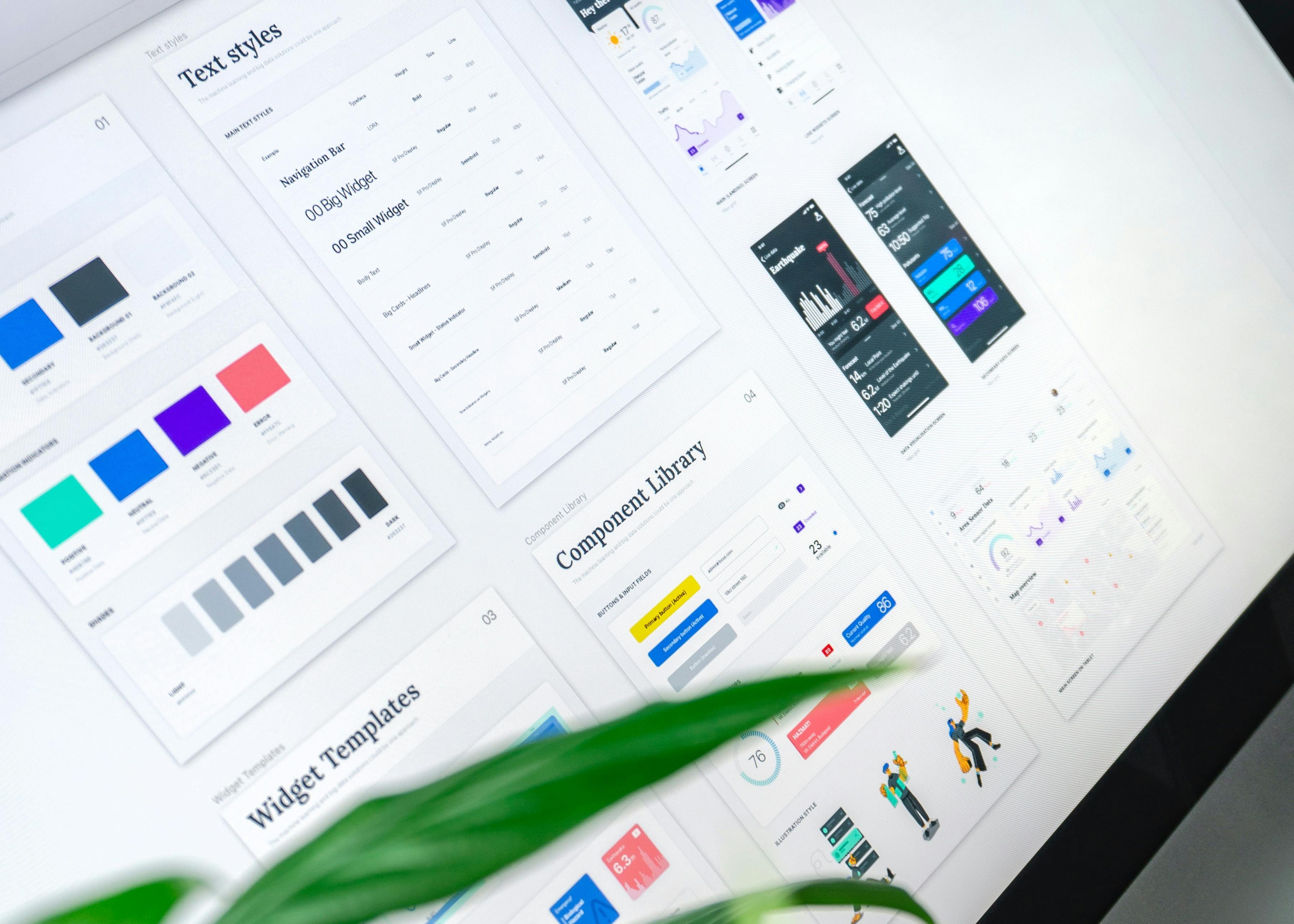
Components — The Building Blocks
When we talk about a design system, components are the first thing that comes to mind. They are the reusable, self-contained pieces of UI that serve as the foundation of the system. But what goes into creating these building blocks?
The Concept of Atomic Design
The atomic design methodology breaks down interfaces into fundamental building blocks: atoms, molecules, and organisms.
- Atoms: These are the basic UI elements like buttons, input fields, and typography.
- Molecules: A group of atoms functioning together as a unit, such as a search bar with a button.
- Organisms: Complex UI compositions or patterns made up of groups of molecules and atoms.
Design Tokens: The Subatomic Particles
Before we even get to atoms, we deal with what can be considered the 'subatomic' level — design tokens. These are the variables that store design-related values like colors, font sizes, and spacing.
// Example of design tokens applied to a Material UI theme

import { createTheme } from "@mui/material/styles";

let theme = createTheme({
  palette: {
    primary: {
      main: "#0052cc",
    },
    secondary: {
      main: "#edf2ff",
    },
  },
});

theme = createTheme(theme, {
  palette: {
    info: {
      main: theme.palette.secondary.main,
    },
  },
});
Crafting Components with States in Mind
When designing and developing components, it's important to consider their various states. For instance, a button can have different states like default, hover, disabled, and active. Each state may have unique styles and behaviors.
Component Variants for Scalability
Components often come in multiple variants to suit different use cases. For example, a button might have a primary, secondary, and tertiary variant. Using a prop-based API allows us to manage these variants efficiently.
// Example of a button component with variants in React

<Button variant="primary">Primary</Button>
<Button variant="secondary">Secondary</Button>
<Button variant="tertiary">Tertiary</Button>
Component Documentation: A User Manual for Developers
Good components are self-explanatory, but great components come with thorough documentation. This includes not only the API specifications but also best practices on when and how to use the component effectively.
Component Generation Tools: Streamlining Component Creation
Creating components manually for every new project or feature can be a tedious process. To simplify this, consider creating a custom npm script that automates the boilerplate code generation, allowing developers to focus on the unique functionality of each component. For example, a running a script like npm run generate MyComponent could generate a barebone component file, a corresponding Jest test file, and a Storybook file with a default story.
Using a custom generation script offers several benefits:
- Consistency: It ensures that all components are created following the same structure and guidelines.
- Efficiency: It automates the repetitive tasks involved in component creation.
- Flexibility: It can be tailored to meet the specific needs and workflows of our team.
By leveraging automation, developers significantly reduce the time and effort required to create new components, making the design system more agile and easier to maintain.
Conclusion and Future Directions: The Road Ahead
We've taken a comprehensive journey through the world of design systems, exploring everything from the foundational tools and processes to the minutiae of component creation. As we've seen, a design system is not just a collection of reusable UI elements; it's a living, evolving entity that requires ongoing care and attention.
Key Takeaways
- Holistic Approach: A design system is more than its visual components; it includes the tools, processes, and people involved in its creation and maintenance.
- Interdisciplinary Dialogue: The design system serves as a bridge between design and development, fostering seamless collaboration.
- Automation and Efficiency: Tools like custom component generators, CI/CD workflows, and visual review and testing tools can significantly streamline the development process.
Future Directions
As products and teams continue to grow, so will design systems. Consider the following for future iterations:
- Expanding the Component Library: Adding more complex components and patterns to meet evolving design needs.
- Enhanced Documentation: Introducing interactive examples and more comprehensive usage guidelines.
- Per-Product and Per-Instance Theming: An ambitious goal is to allow for customized theming at both the product and instance levels. This will enable organizations to offer white-label versions of their products, tailored to individual client needs.
By constantly updating and refining our design system, we aim to create a robust, scalable solution that not only meets current needs but is also equipped to handle intricate customization and future challenges within the organization.
Resources
- Design Systems for Developers by Storybook